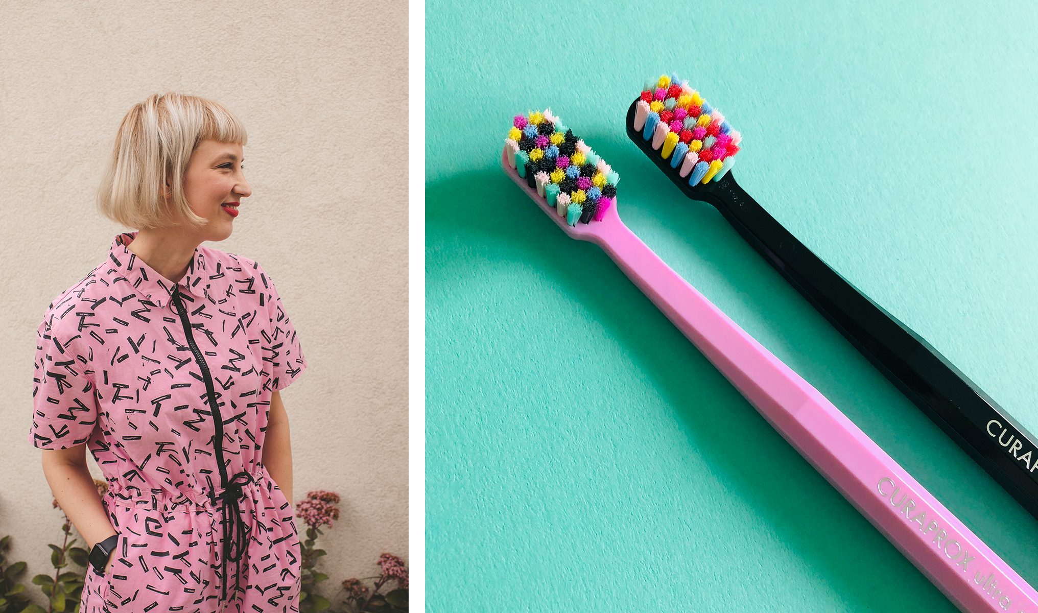
Deep in our childhood memories, one can often find an abundance of inspiration for future artistic endeavours. For Michaela, born during the vibrant ‘80s, her childhood memories of playing PC games, reading comics and watching kids’ tv shows full of boldness and colour helped inspire her to create an edition of toothbrushes vividly reflecting this era. Borrowing from the ‘80s cheerful colour palette and working with bold shapes, she’s managed to capture the carefree atmosphere of those years and bring it back into our homes and bathrooms.
Michaela is no stranger to designing special editions of Curaprox toothbrushes. Her POP ART edition has been a highly praised and sought-after toothbrush design since it first launched back in 2017.
Dive into Michaela’s story to learn what this artist and designer cannot imagine her daily life being without, and how she goes about creating her playful designs.
What was your path to becoming a designer?
I have been drawing and creating ever since I was a small child. After finishing elementary school, I went on to study at the School of Applied Arts in Bratislava, where I thrived. Applying to the Academy of Fine Arts and Design was a natural decision after that. Being part of the creative community was essential and helped me to stay inspired and evolve.
“I really love creating in itself, but working with colours, shapes and geometry while using different media is very pleasing and rewarding.”
What type of projects do you usually work on now? And what do you enjoy the most?
Currently, my portfolio includes mostly brand identities but also a few personal projects, including serigraphy prints and t-shirts. Sometimes I collaborate with other artists here in Slovakia, mainly fashion designers or musicians. At the moment, I’m enjoying being a part of the Slovak branch of Curaprox, working as an art director. I really love creating in itself, but working with colours, shapes and geometry while using different media is very pleasing and rewarding for me.
What inspires you?
Travelling gives me endless sources of inspiration, particularly the changing of an environment – not only on a geographic level but also in everything connected to the change of location. Both urban and rural environments are blooming with diverse cultures, natural landscapes, people and their interactions. I like consulting my work with fellow artists and friends.
What are the daily rituals you can’t imagine your day without?
The daily ritual I absolutely can’t do without is drinking green tea in the morning. I can’t leave the house without drinking a huge steaming cup of my favourite brew. Whenever possible, I cycle to the office. This is my main source of transportation in the city and it always boosts my energy levels whilst also helping to protect the environment.
And although not a ritual per se, I also need to have my pencils sharpened whenever I start creating – that is a must.
How did your collaboration with Curaprox start?
It actually started a few years ago when Curaprox Slovakia asked me to create a design for their new limited edition of duo pack toothbrushes. We called it the POP ART edition and launched it in 2017. Soon after that, we realised that we got on and collaborated very well, and so when the right time arose, I began working as an art director for the branch. Creating my second limited edition design, after the first one being so successful, was a huge challenge. But I enjoyed it very much!
“I wanted to bring the cheerfulness and positive bold style of the ‘80s back into our rather dull and overly tweaked contemporary bathroom accessories.”
What’s the idea behind your special edition of toothbrushes? What did you want to express?
The one we are currently launching is inspired by the ‘80s – vibrant, neon colours, the vibe and architecture of the 1980s bars, pubs and diners, the flashy, flamboyant interiors and bold, eclectic fashion accessories and styles.
I wanted to capture the carefree and vibrant atmosphere of this era and bring it back into our homes and bathrooms.
How did you choose the colours?
The colours are based on the ‘80s palette. I wanted to get their cheerfulness and positive bold style back into our rather dull and overly tweaked contemporary bathroom accessories.
What was the biggest challenge of this design?
To make sure I didn’t make my design too kitschy, which the ‘80s had a tendency to be. I wanted to balance the visual appeal of my design by capturing the flamboyancy of the ‘80s, yet not make it too over-the-top.

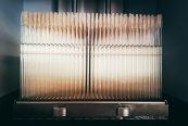
Get the ‘80s glow
The CS 5460 ‘80s edition – a package of two ultra-soft toothbrushes with a design by Michaela Chmelíčková – is now available in the e-shop.
Get yours now
How would you like people to think about your toothbrush?
Mostly, I would like my toothbrushes to make people’s daily routine a bit more fun and positive, and maybe even to think of them as their everyday fashion accessory. Plus I wanted to show the younger generations a glimpse of the ‘80s atmosphere, a time that has long gone, by designing this tiny time-travel souvenir.
Did you know Curaprox before the first collaboration? How do you perceive the brand?
Yes, I have known Curaprox for many years now, probably since they opened their Slovak branch. I remember being fascinated and captivated by the bright colours of their toothbrush handles and bristles.
Is there any dream product that you would like to collaborate on?
There are a lot of them! I would like to design a label for good wine, or create the look for a beloved and useful public space, such as a playground. Or design a nice graphic fabric – a towel, blanket or a rug perhaps. The possibilities are endless.

Michaela Chmelickova is a graphic designer, illustrator, visual artist and art director who uses the artistic name Planeta 220. She graduated from the Academy of Fine Arts and Design Bratislava, in the Department of Visual Communication. Her style is simple, geometric, vibrant, sci-fi and futuristic. Born in the 1980s, she often makes use of nostalgia, and draws inspiration from the PC games, comic books or kids’ TV shows of her childhood. She lives and works in Bratislava. To see more of Michaela’s work, follow her on Instagram, scroll her Behance or have a look at her website.
Photo credits: Petra Rjabinin